Ryan Olbrysh is a popular choice for higher education publications: His digital collages are meticulously planned, harmonious, and aligned with the school’s brand story. Below we highlight several of Ryan’s projects for College & University magazines from the past few years, along with insights from Ryan on the design choices that went into crafting these photo-illustrations.
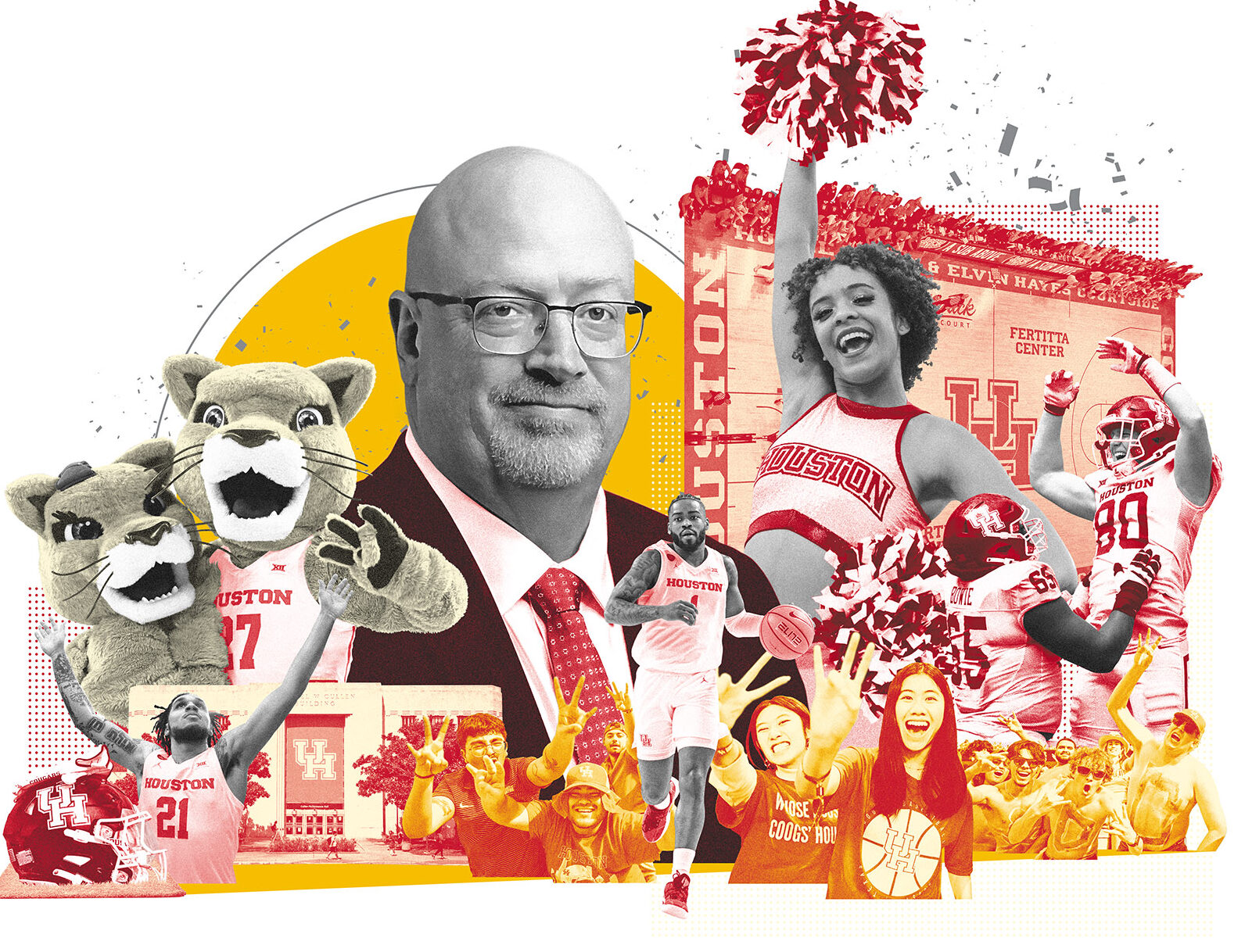
University of Houston Magazine Fall/Winter 2024 – Leadership branding veteran Patrick Mulligan elevates the university’s profile nationwide. AD: David W. Radabaugh
“Incorporating black and white imagery is a great way to make a brand’s colors really stand out.”
Harvard Magazine, July/August 2022. Aiming For Excellence: Higher Education Ambitions—And Shortcomings. AD: Jennifer Carling
“I always appreciate when a client will reference a previous piece of mine as inspiration for the piece that I will be creating for them. This illustration gets referenced a lot, and I will then ask which part of it they find appealing: ‘Is it the color palette?’ ‘The arrangement?’ ‘The size relationships between elements?’ It’s best not to guess what exactly it is that’s catching someone’s eye.”
Georgia Tech Alumni Magazine, Fall 2022 – 40 Under 40: How To Be A Changemaker. AD: Karen Matthes
“Sometimes I’m asked to incorporate a headline into the illustration. I often look at my collage process as if I’m building a physical set for a stage play or some crazy musical, and it was fun to take those big 3D ‘HOW TO’ letters and plop them right down in the middle of everything.”
Miamian, Fall/Winter 2022 – The campaign for Miami University: days of old and days to come. AD: Donna Boen
Minnesota Carlson School of Management Magazine, Spring 2024 – Marilyn Carlson Nelson Leads Carlson School Transformation. A $40 million donor-funded project will transform school spaces and name the flagship building for Marilyn Carlson Nelson. AD: Elizabeth Sprouls, Skelton Sprouls
“These two pieces [Miami University and Minnesota Carlson School of Management] are good examples of how varying the size of people and objects within a busy illustration can help guide the viewer’s eye around what they’re looking at. There’s a lot happening on these covers, but I like to think that the elements all have room to breathe and there are a lot of visual entry points.”
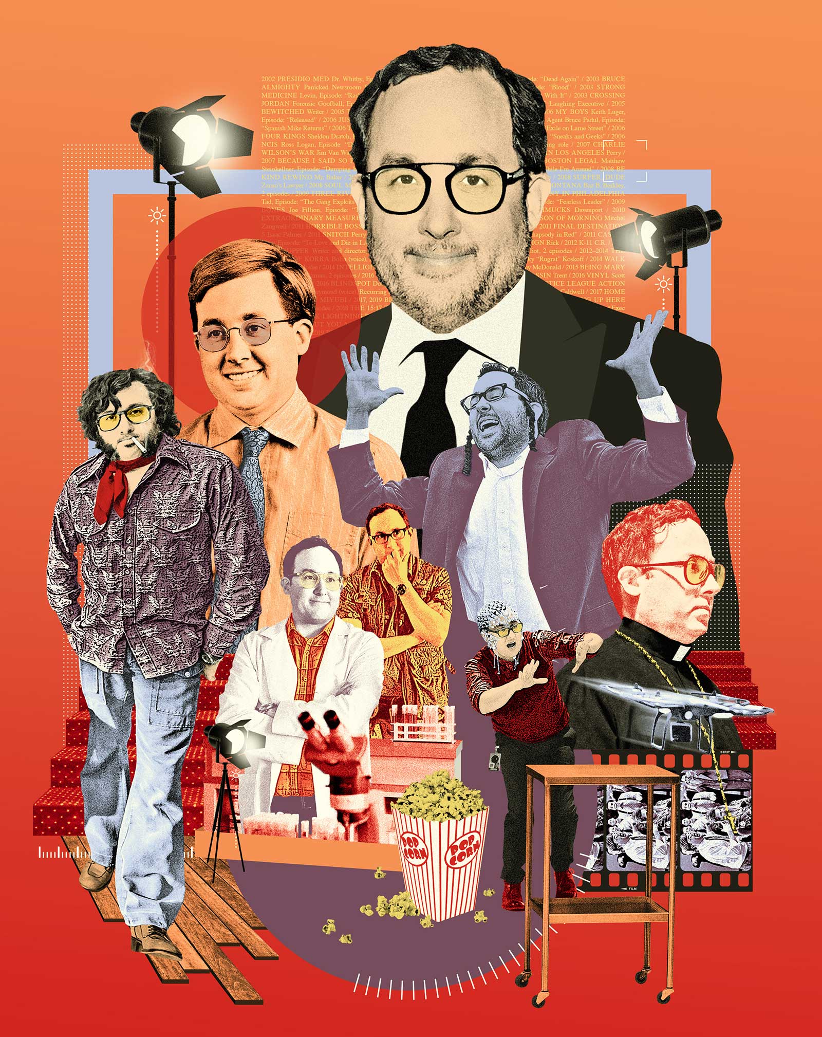
Boston College Magazine, Summer 2022 – The Many Roles Of P.J. Byrne: A Renowned Character Actor Who’s Appeared In Countless Hit Movies And Television Shows, Byrne’s Star Is On The Rise. AD: Keith Ake
“When I see a good opportunity, I love to use text in my illustrations. In this case I took actor P.J. Byrne’s entire filmography and styled it into one long paragraph that I then placed in the background. Most people probably won’t look closely enough to see what the text actually is, but I like knowing it’s there.”
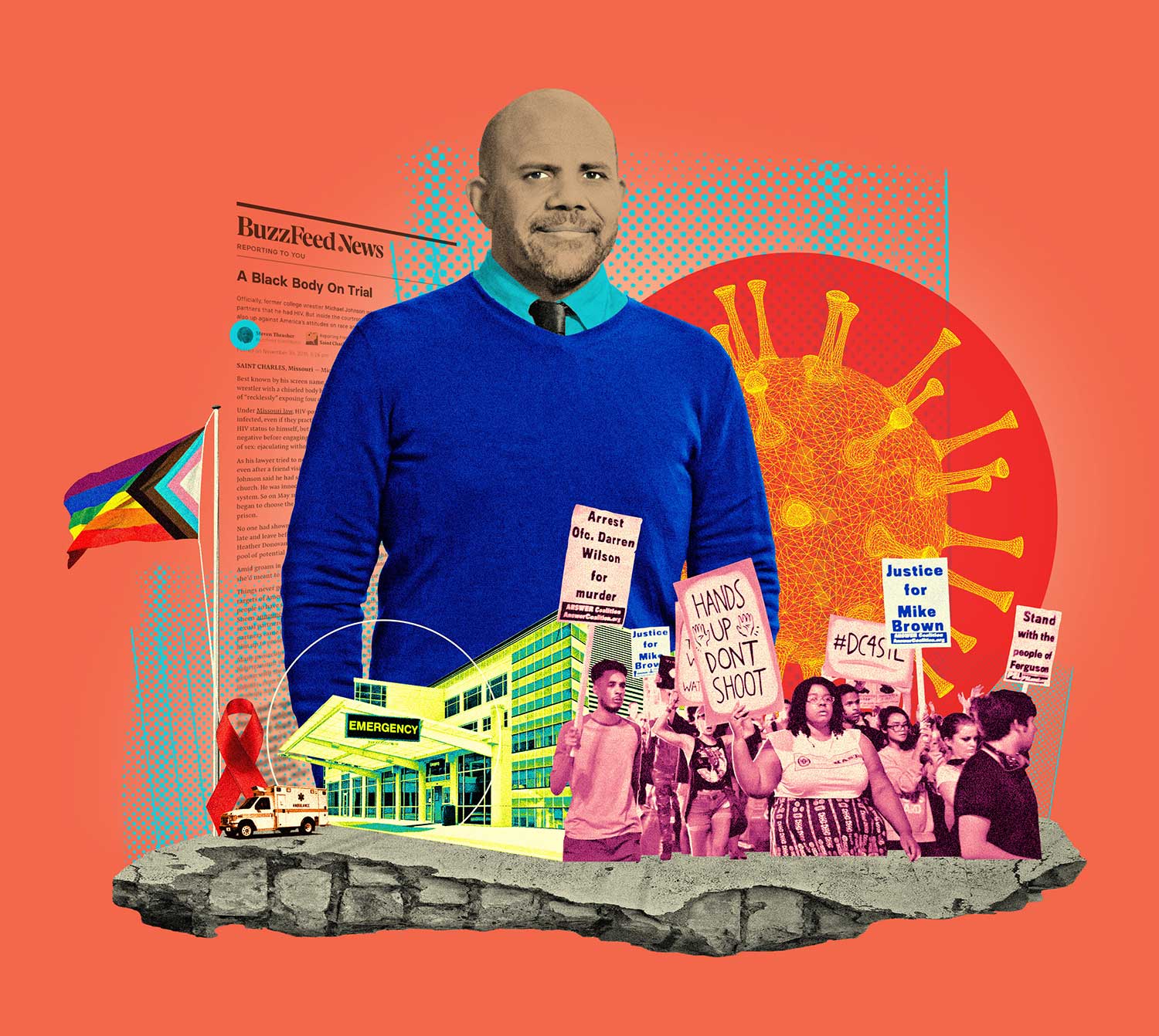
Northwestern Magazine, Fall 2022 – Bearing Witness: Steven Thrasher Has Spent His Career Reporting On Social Justice. Why Can’t He Stop Fighting? AD: Christina Senese
IMPACT, the magazine of the Weill Cornell School of Medicine – At The Forefront of Immunometabolism: Dr. Anjin Xianyu and Dr. Ke “Dave” Xu. AD: Kevin Sprouls, Skelton Sprouls
“I think these two illustrations [Northwestern and Weill Cornell Medicine] represent what’s possible when all you have to work with are basic studio portraits of people. If I were flipping through a magazine and all I saw were a photo of some professor I’d never heard of, it would be very easy for me to just keep on flipping. But if you place those photos in surroundings with the express intent of peaking someone’s interest, chances are good they’ll stop flipping and give the story a read.”