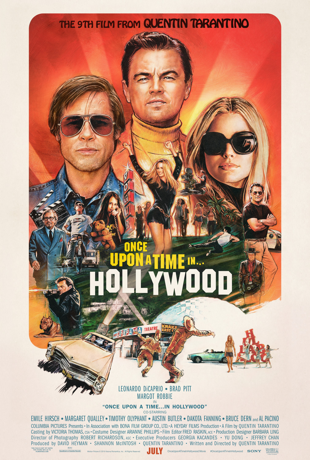
With a 30 year career hand painting movie posters for Hollywood blockbusters, illustrator Steve Chorney keeps the creative tradition relevant and exciting. This can be most notably seen in Steve Chorney’s illustrated movie poster for Quentin Tarantino’s highly anticipated film, Once Upon A Time In Hollywood, as well as a prop poster for a fictional film featured in the movie, Operation DYN-O-MITE.
“An illustration, by its nature can use “artistic license” to add that extra something – that little bit of magic.”
– Steve Chorney

The retro feel of Steve Chorney’s illustration harks back to the culture of Hollywood in the 1960s. His poster for Leonardo DiCaprio’s character, Rick Dalton’s film Operation DYN-O-MITE can be spotted plastered around Hollywood at various locations featured in the film, including the old sixties venue the Aquarius Theatre pictured below.


We recently asked Steve to reflect on his brilliant career…
How did you find your style for illustration? Were movie posters an inspiration for you when you were young?
Not really, I do not recall seeing many movies when young. I do recall a crazy Jack Davis poster for ‘It’s a Mad, Mad, Mad, Mad World’ in the 1960s. Being that Jack Davis’ comical work could be seen in MAD Magazine back then, it held my interest. My interest in the commercial arts at that time resulted from the Recording Industry and the art seen on record albums and the fantastic San Francisco concert Posters.
What drew you to the tradition of illustrated movie posters?
While working in Hollywood in an animation studio I began to notice movie poster art. The days of record album art had faded somewhat and the art seen on Movie posters began to take on a different new look.


What was the first movie poster you illustrated?
My first attempt at a ‘Movie Poster’ was for an animated film which was never released as planned…Animalympics, voiced by Billy Crystal and Gilda Radner. The next was for a little known Neil Simon movie with Walter Matthau: “I Oughta Be In Pictures”.
How has your style developed over time?
As an Illustrator we tend to mimic other styles since movies are often set in different time periods or genres. The goal is to give a sense of the movie in the artwork. If anything, style develops by examining the works of other artists past and present and adding it to our skill set.
Some people say that the tradition of hand illustrated movie posters is dying, what are your thoughts on this?
It died already! It has been dead since the late 1990s! It appears that lately there has been a kind of reignited interest in the “hand-crafted” illustrated Movie Poster. The last few years has seen a trend toward more and more illustrated treatments in film posters. Yippee!

Why should a movie use a hand illustrated poster over a photographic poster for promotion?
Illustration can bring so much spontaneous excitement to a subject that photos just cannot achieve alone. Not that every poster should be illustrated, photography has it’s place in marketing and communication to be sure. But an illustration, by its nature can use “artistic license” to add that extra something – that little bit of magic.
Which movie poster has been your favorite to create, why? Can you please attach an image of it?
Maybe I would say my favorite work was on Tom Sellecks film: Quigley Down Under. I enjoyed working on the concepts and the final art. I also was fortunate to be at the Movie Premiere in Hollywood and meet Mr Selleck and his fellow actors from Magnum PI. The added plus was my love of all things Western!
Here are a few more poster highlights by Steven Chorney:
2018 – Mary Poppins Returns

2018 – The Other Side of the Wind

2017 – The Greatest Showman

2015 – Mission Impossible: Rogue Nation

2015 – Hot Tub Time Machine 2

2014 – Inherent Vice

2014 – Birdman

1992 – The Distinguished Gentleman

1986 – Labyrinth

Read It’s Nice That‘s article About Steve Chorney’s movie posters.

